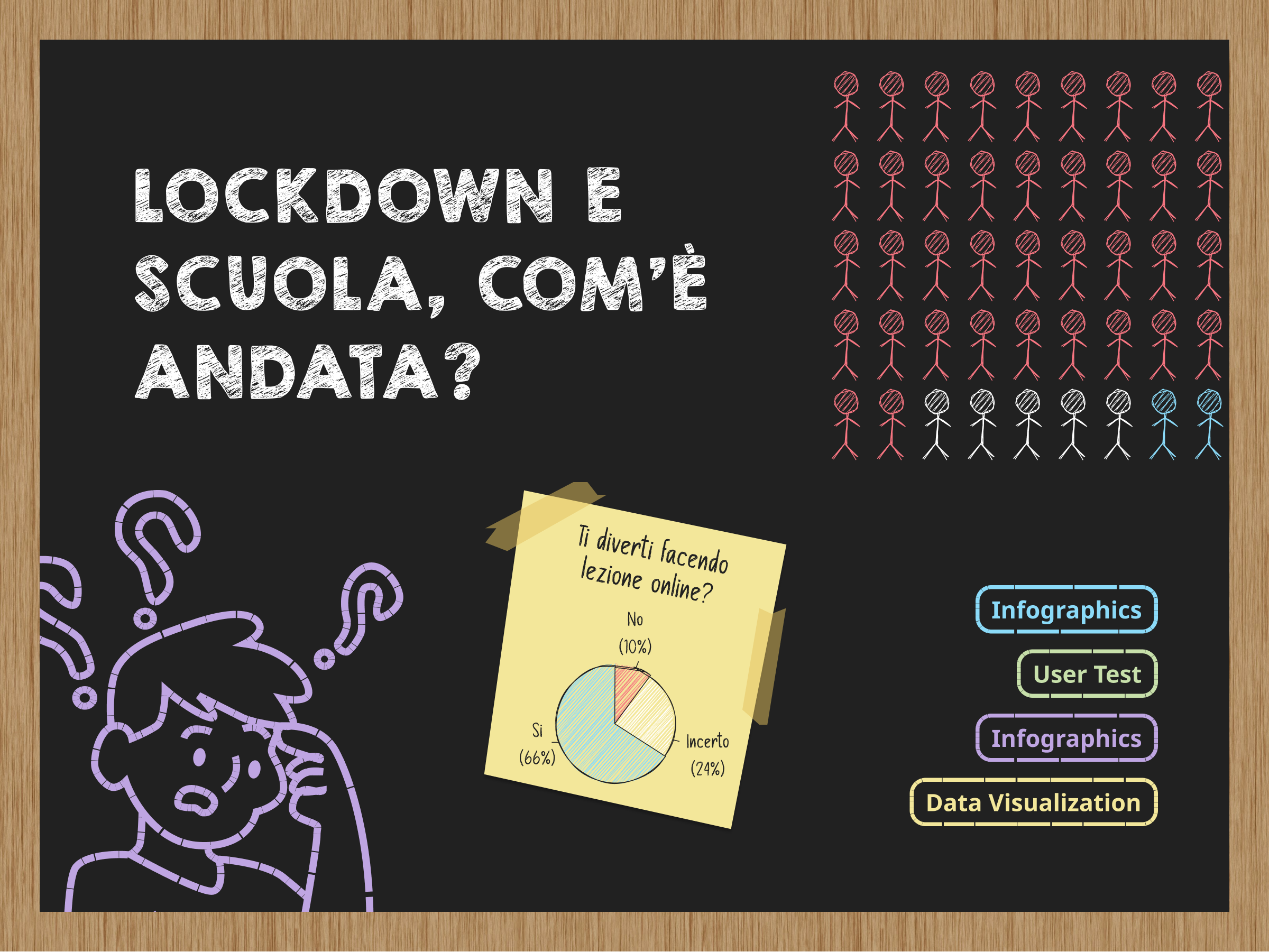
Scuola e lockdown
What has changed for students all over the world during Covid-19? We tried to answer to this (difficult) question using different research dataset and joining them in a cute and funny infographic that tells a story. In order to improve the usability of the graphics we made use of a survey and user tests.
Tools & methods: Figma, Microsoft Excel, Tableau